Sperrow

Domain: Fake News
Platform: Twitter
Problem Definition: Discourage a user from spreading potential fake news on social media platforms.
What is the problem? I don’t understand!!

The credibility of posts or accounts on social media has always been a topic of concern. Public figures have verified accounts, but they constitute only a small fraction of the total user base on any available platform.
The considerable chunk is the "Other" crowd, and the line between what is trustworthy and what is not is blurry. An equally important question is whether you as a user might reveal more information than you intend to.
Flagging fake content isn't always enough and is rather challenging in real-time, as accounts that spread such content would continue to do so, and due to the volatile nature of such information, people would tend to follow such posts. After a while, the distinction between what is fake and what is not is no longer clear.
Who do we target and Why?

Our motivation is to discourage the spread of fake news. In today’s world, Twitter and other social media platforms have become a hothouse for false news dissemination.
Fake news often leads to widespread violence and blinds people to see through the false stories towards “the obvious truth”.
Thus our target audience is every common man. It empowers them to check the cross-check facts of a post a user comes across or is about to post.
This way of encouraging a user of fact-checking themselves is the perfect balance between the spectrum of not having a system in place at all and having a strict system censoring and removing the content entirely
This also should instill a sense of responsibility amongst the users as well, as they are given all the facts and the post they want to follow, and is left to the user’s discretion whether to further share or post about it or not.
We surveyed Some people before setting our goals...
We surveyed around 45-50 people about their experience on social media, and how often people find fake news. Some of the key insights from the review are discussed below
Over 62.9% of people agree strongly (4 more or points) with frequent encounters with fake news on online platforms.
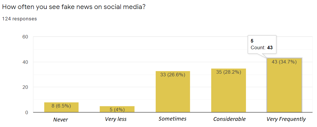
Fig 1: User Feedback on how often they encounter fake news
Over 75% of the total number of people surveyed, said they would be more than willing to change the content of the tweet they are about to post if they are presented with information about the event they’re posting about before they actually post it.
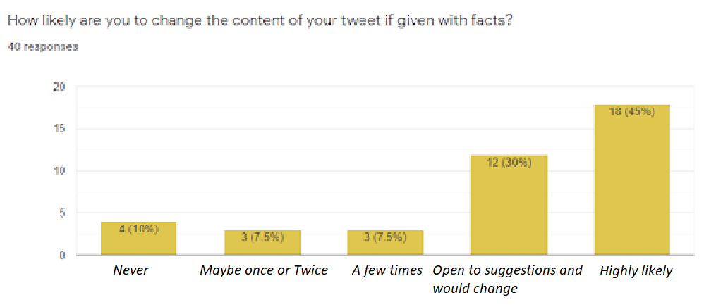
Fig 2: User Feedback on how likely they are to change what they are about to post if given the correct facts
What did we come up with?

We ideated an extension to the already existing user experience one gets on Twitter. To curb the spread of fake news, we wanted to give the user a passive nudge. This nudge would be in the form of summaries of news articles corresponding to the event the user is posting about crawled from the web. This is displayed just beneath the actual tweet the user is about to post. That’s it, the extension does not instruct neither recommends the user certain changes, but rather just passively lays out useful facts in an easy-to-read and comprehensible way.
This way, we encourage self-aware fact-checking, and since real-time automated fact-checking is a difficult task, the proposed solution encourages user participation in tackling an otherwise hard problem.
Fig 3: Overall Structure of the Extension + Web App
The extension:
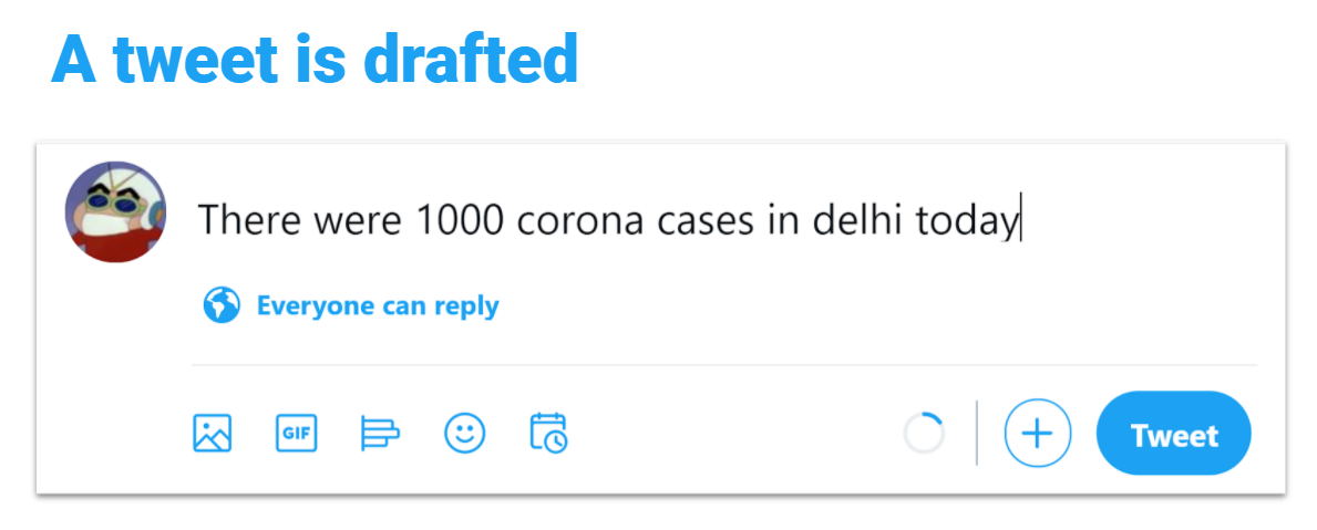
The extension on Twitter provides an additional button (just like any other tool like Grammarly), when this button is clicked, the extension reads the Tweet the user has typed (but not yet posted), now since this Tweet hasn’t been posted it is not available on Twitter publicly and hence cannot be accessed via the Twitter API.
Thus the extension reads it from the local HTML division from the browser itself. This collection and further processing is done on the user end. This extracted tweet is then sent to the Server by the extension
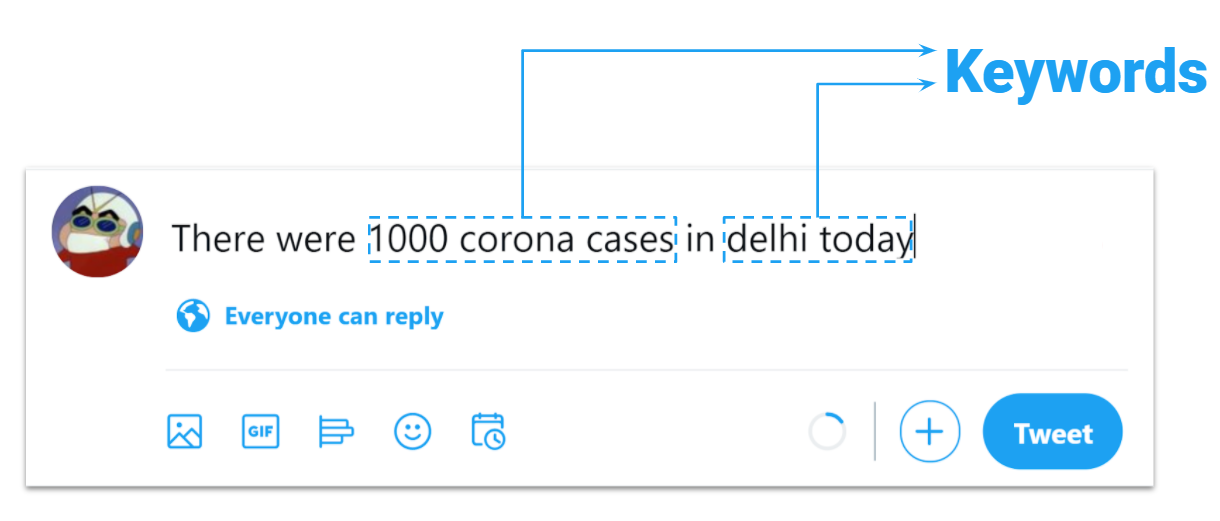
The server receives this tweet and extracts the relevant keywords from it. Suppose the tweet goes like “India has plenty of oxygen, and coronavirus is almost over” From this, the server shall extract words like India, Oxygen, coronavirus. These are concatenated and several new sites are queried using their respective APIs.
The results from the top 5 such news sites are fetched and are summarized individually. Then the summarised produced are concatenated and this concatenated summary is again summarised. This is done in order to avoid repetition of facts from the different sources and to produce a much more concise summary with the correct facts. Since the results from only a single source can be biased multiple such sources are considered.
The obvious tradeoff that we face is in terms of processing speed and the correctness and meaningfulness of the suggested summaries. If we increase the number of news sources the quality and authenticity of results increases but the performance goes down and we observe delays of over 3-4 minutes (which obviously is too long for anyone to wait for), but if we consider only 1-2 sources the results would be biased and might be incorrect too, but the processing time is negligible and the results are displayed instantly. Thus we find the sweet spot by considering 5-6 sources which give a delay of 21 seconds on average (as reported by the people that helped us in evaluations)
A pictorial representation of how the extension works:
Step 1:
Step 2:
Step 3:


The result:

Fig 4: Pictorial Step by Step Representation of how the extension works
Real-time use of the extension:

Fig 5: The extension in action (The tweet is typed in the tweet box and the extension returns the summary just below after the bird icon is clicked)
We also build a web app to complete the overall user experience
The dashboard contains the key points from the most discussed topics (based on popular hashtags/News Articles) presented to the user in an effective way such that the information is easy to grasp and does not overwhelm the user.
The user gets a summary of their activity on Twitter on a weekly basis, based on the hashtags they followed, the number of tweets posted being later verified as misinformation, and their usage of offensive cuss and hate words. This gives them a sense of their activity on Twitter and can analyze how good or bad they have been in terms of spreading or containing false information spread.
The Web portal also summarises the Twitter Privacy policy and gives a glimpse of how twitter deals with fake content. Given Twitter handles misinformation on an event-to-event basis, there is no concrete policy but the app gives an idea of what a violator should expect as a punishment.


Fig 6: The interface of the User dashboard
Few sample statistics from the web app and how they're useful to the user:
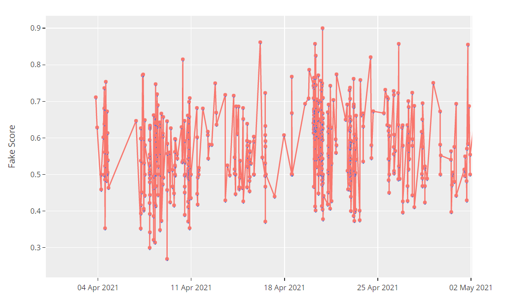
Fig 7: Fake News scores for the tweets a person posts as displayed on the web app (for analysis purposes the graph represents data for a month instead of the week as displayed on the app)
This plot shows the fake score of tweets. The graph is interactive and clicking on a particular redirect the user to the tweet to which the score corresponds to. This score is calculated by analyzing the tweet’s content and is indicative of how much fake news has the user spread in a period of one month. This could help the user in being more conscious and wary of the content he posts on the platform, and nudge him to try to use our extension to easily verify the tweet from reliable sources before posting it.

Fig 8: Number of Profane words used in the tweets a person posts as displayed on the web app (for analysis purposes the graph represents data for a month instead of the week as displayed on the app)
This plot shows how the count of profane words the user has used. The graph is interactive and hovering the count shows the list of profane words the user has used in his tweet. This could help the user in realizing if any of his tweets could have been way too vulgar and profane to be posted on the platform.

Fig 9: Trending topics and the number of tweets corresponding to each as displayed on the user dashboard
This graph shows the most trending topics/hashtags on a particular day. This will help the user in staying up to date with the latest trends on Twitter not just for the current day but also for the past few days. It could also help the user in catching up to the hot topics in case he hasn’t been active on the platform in a while.
Exit Survey and Evaluation:
We surveyed 5 people and gave them the app to use for a span of 5 days, and then studied their behavior to analyze the usefulness and effectiveness of the solution proposed. We tried to accommodate people spread across different age groups and genders to account for diversity in terms of use patterns. The following were the metrics we used for evaluation
Metrics used for Evaluation
Number of times changes were made in the tweet being posted based on the summary given (M1)
The number of times the given summary was relevant to what is being posted (M2)
The number of posts made by the people using the extension (M3)
How useful was the dashboard for the users (out of 5) (M4)
The following is the table representing all the metrics for each of the participants. The intensity of color in each cell denotes the performance of the app. The darker the cell, the more favorable the score is for the application.
Table 1: Evaluation Metrics for each of the participant involved in the feedback process
From the above we derive several interesting insights, these include the effect of age in terms of use of Twitter in general and the extension in particular. It also reflects how likely a general user is to change what they are about to post based on some information presented to them. We also try to reflect upon the shortcomings of the solution :(
Key Insights from the feedbacks
1 Person did not post at all :(
Rest 4 did post, and 86% of the time the summary given to them was relevant.
Mostly irrelevant summaries are displayed for Personal Tweets.
Out of the times, the summary was relevant 70% of times users changed what they were about to post.
The average rating the web app got was 4, thus most users found the web app to be complimenting the way the extension helped them post more aware content.
All the 5 users used the web app 3-5 times during the period but most found the installation process to be cumbersome. Due to resources crunch, we can’ host it right now (Models have embeddings of 2+ GBs). This problem can be solved as we move forward and get resources.
The one person that did not post anything :( and forgot about the extension, who was aged above 40. They did not use Twitter that often and thus their activity reflects this. This can be the general case given most elder people are not that into posting regularly
3 that did make more than 1 average post per day were between 20-30 years old
Only 1 person changed all his tweets given the summary. The age of this participant was 16, it could be because they were told to use the app in a way, so they did so, but otherwise, it can also be the age that they might believe in what they read from a news site.
Feedback From Users
We asked for feedback from the users that used our app and helped us in its evaluation, the following are some of the common ideas and reviews we got, these aren’t all the reviews but they reflect the general feedback we received.
“Nice tool!, Helped me to fact check info. I deliberately feeded few wrong info, still tool was able to show me correct picture of overall argument. Suggestion: It is still not detailing the minute things about my tweet, and showing broad picture, maybe you can work on that”
“I really enjoyed this tool. But it still seems like under development. Requires significant effort to setup tool on system. Idea seems very useful to me. It would be great if you host this system, and make installation easy”
“New concept for me, still digesting, How useful it can be? Still a question for me. But I believe this tool can be leveraged into something very interesting. Also setup is tough, please host it before going for large test. Setup requires effort”
“Need work on UI. Once UI is settled, tool has potential to serve community and make people aware. It is not forcing me saying whatever I have written is false, suggesting me the whole content, which is good subtle nudge for user, fresh way to tackle fake news.”
Watch the idea in action:
TLDR (too LAZY didn’t read 🙃) Here, look at the slides then tinyurl.com/sperrow
The code is available publicly Here
Meet our Team

Acknowledgment:
This project was completed under the guidance of Ponnurangam Kumaraguru for the course CSE648 Privacy and Security in Online Social Media.


Comments
Post a Comment